Building multi-column layouts with the WordPress Columns block is easy, but when you start testing those layouts on smaller screens, the default responsive behavior built into the block editor can feel restrictive. This is where the Twentig plugin helps. It adds extra responsive options to the WordPress Columns block, so you can fine-tune how columns stack and change the visual order across devices.
Why WordPress responsive columns can be limiting by default
By default, WordPress stacks columns on mobile, which turns your layout into a single-column view. That works well in many cases, especially for two-column or simple three-column sections. But some layouts need more flexibility — a compact footer, a four-column feature grid, or alternating image-and-text sections often require more control over how columns behave on tablet and mobile.

For more advanced responsive columns in WordPress, it helps to control both the stacking breakpoint and the visual order of content.
How to control responsive columns in the WordPress block editor
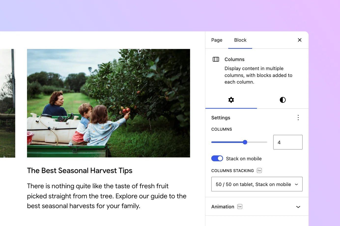
The Twentig plugin adds a Columns Stacking setting with three additional options, giving you more control over how your columns behave across screen sizes. To follow along, install Twentig from the WordPress plugin directory.
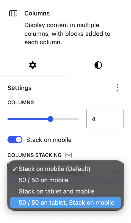
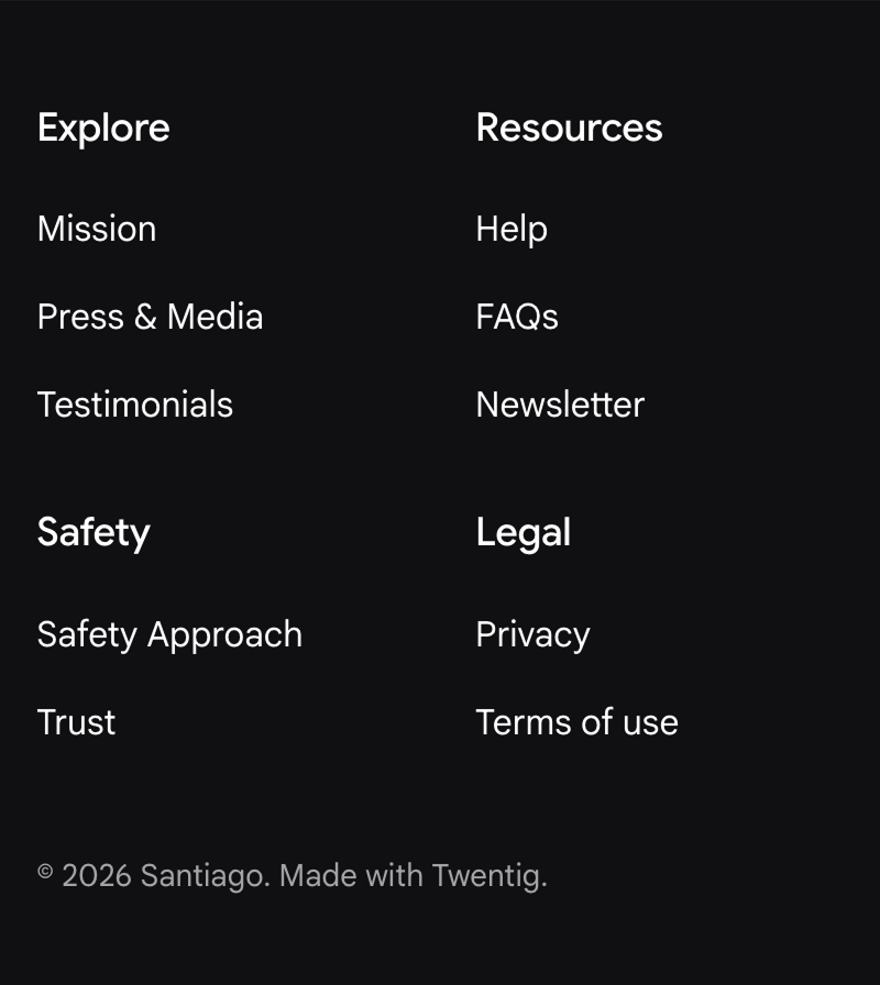
50/50 on mobile
With this option, each column spans 50% on screens smaller than 768px.
This is especially useful when you want to keep a layout compact on phones. A good example is a four-column footer navigation. Instead of collapsing into one long vertical list, the links stay in a clean two-column grid on mobile. This option also works well for three-column and four-column layouts where keeping content grouped makes the section easier to scan.
Stack on tablet and mobile
With this option, each column spans 100% on screens smaller than 1024px.
This works well for side-by-side image and text layouts. Imagine a hero section with a heading and paragraph on the left and an image on the right. On desktop, the composition looks balanced. On tablet, though, the text column can start to feel cramped. Stacking earlier gives the content more room and improves readability.
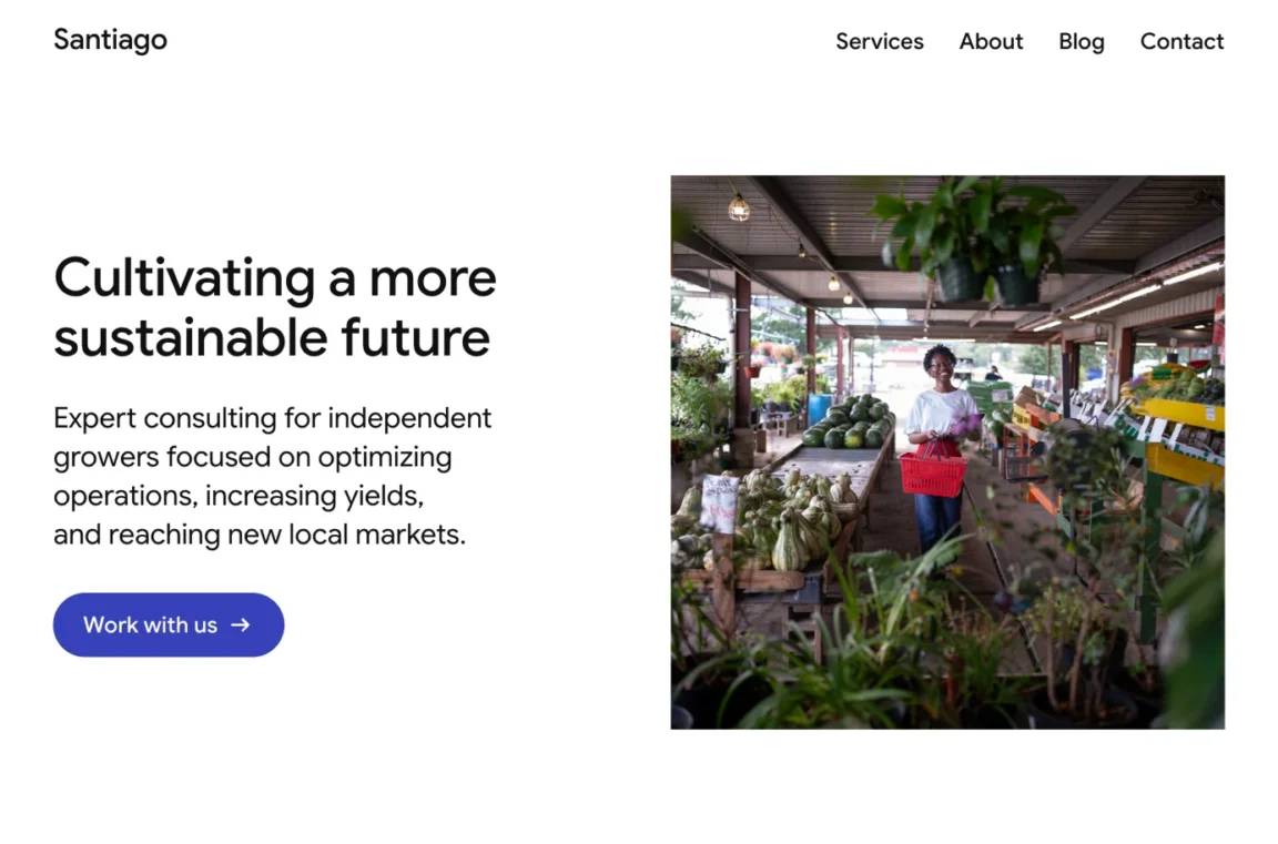
Tip: When using this option with a text column, your text block can become very wide on tablets once the columns stack. To address this, enable the WordPress “Inner blocks use content width” option on the Column block. You can also set a custom content width and adjust the content alignment for even more precise control.
50/50 on tablet, stack on mobile
With this option, each column spans 50% on tablet viewports (between 768px and 1024px), then switches to 100% width on mobile screens below 768px.
This works well for three- or four-column layouts. With the default WordPress behavior, a four-column layout jumps straight from desktop to a single column on mobile, with no intermediate step. On tablet portrait screens, four columns often leave too little space for each column. A 50/50 layout fills that gap, distributing content more evenly on medium screens before switching to a single-column view on mobile.


Reorder columns on mobile or tablet
By default, WordPress stacks columns from left to right, in the same order they appear in the editor. In most cases that is exactly what you want. But for certain layouts, the best visual order on mobile is different from the desktop order.
Twentig includes responsive CSS classes that let you visually reorder individual Column blocks at specific breakpoints:
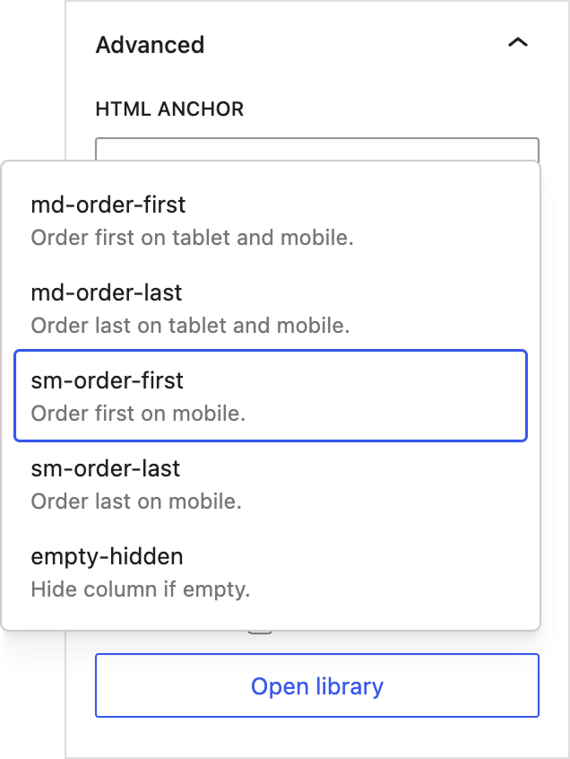
tw-md-order-firstmoves the column to the first position on tablet and mobile (below 1024px)tw-md-order-lastmoves the column to the last position on tablet and mobiletw-sm-order-firstmoves the column to the first position on mobile only (below 768px)tw-sm-order-lastmoves the column to the last position on mobile only
How to apply a class
- Select the Column block (the inner block, not the parent Columns block).
- Open the Block Settings sidebar.
- Expand the Advanced panel.
- Click Open library.
- Select the class you want to apply — it will be automatically added to the Additional CSS class(es) field.
A practical example
A common layout pattern is an alternating two-column design. In the first row, the image sits on the right and the text on the left. In the next row, the positions are reversed. On desktop, this creates a natural visual rhythm.
On mobile, however, you typically want every image to appear directly above its associated text, regardless of which side it was on in the desktop layout. To achieve this, apply the tw-sm-order-first class to the Column block that contains the right-side image. This changes the visual order on mobile so the image displays first, while the editor structure and HTML markup remain unchanged.

Keep accessibility in mind
These CSS classes only change the visual presentation of your columns. The underlying HTML order, and therefore the tab order for keyboard and screen reader navigation, remains unchanged. If your columns contain links or buttons, make sure the tab order still makes sense for keyboard users, as visual reordering only affects what users see, not how they navigate.
To keep your layout accessible, use these classes thoughtfully in sections with interactive content.
More block options with Twentig
The WordPress Columns block is one of the most used blocks for building layouts, but its default responsive settings are limited. Twentig fills that gap with practical options that give you more control over your responsive columns on tablet and mobile, without writing custom CSS.
These responsive column options are just one of the many enhancements Twentig adds to WordPress core blocks. Install Twentig and experience all the enhancements it brings to the WordPress block editor.