Adding an icon to a WordPress button makes it clearer and more engaging. On modern websites, buttons often include icons to help users understand their purpose at a glance: arrows for navigation, play icons for videos, download icons for files.
In this article, you’ll learn how to add an icon to a button in WordPress, what the block editor can and can’t do, and how to add proper SVG icons to buttons using the Twentig plugin.
How to add a button with an icon in WordPress (default options)
The block editor doesn’t support button icons out of the box. WordPress 7.0 will introduce a native Icon block, but it won’t add icon support to the Button block itself. There are two workarounds for now, though neither is ideal.
Option 1: emojis
You can add an icon to a button by typing an emoji directly into the Button block. For example, ➡️ for links, 📞 for contact, or ❤️ for donations.
In WordPress, emojis are usually replaced with external SVG image files rather than inline SVG icons. So even though they use SVG, they still behave more like images than true button icons. They don’t inherit the button color, and WordPress relies on a script to replace them on the page, which can create a visible flicker during load.
Option 2: inline images
The block editor also lets you insert an inline image inside a button. To do it:
- Click inside the button label to place the text cursor
- In the block toolbar, click the More (▾) button
- Select Inline image
- Upload an image or choose one from the Media Library
It works, but the image won’t scale at different sizes and it won’t pick up your button’s color. If you change your theme’s color palette, you’ll need to update every icon manually.
Both workarounds have real limitations. The cleaner approach is to use proper SVG icons, which is where Twentig comes in.
How to add SVG icons to the Button block with Twentig
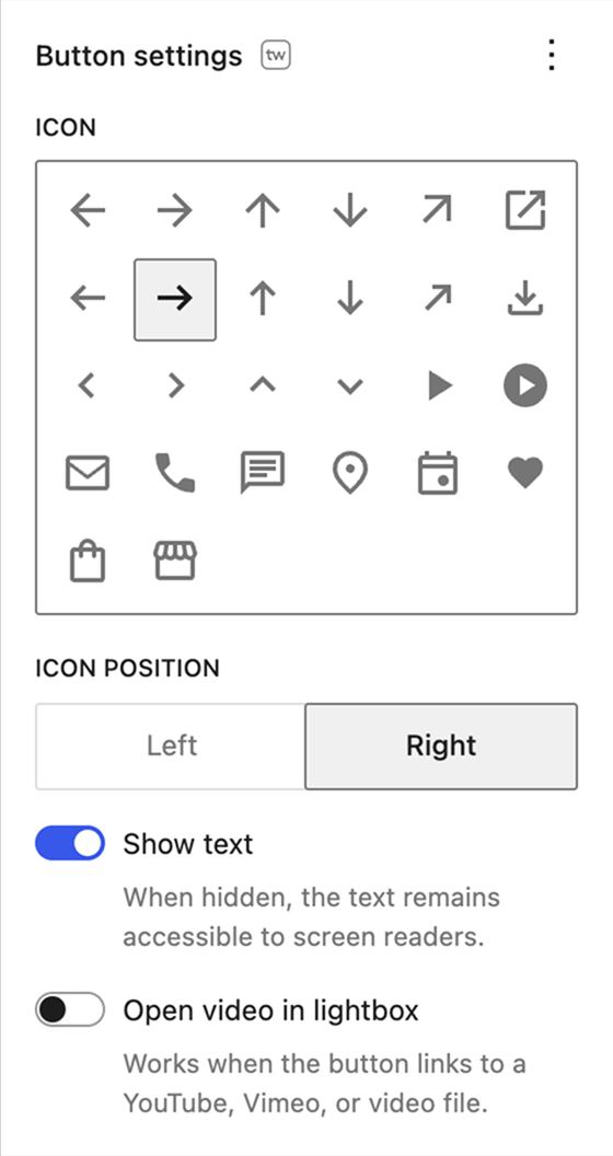
Twentig includes an Icon settings panel for the WordPress Button block, making it easy to add an icon directly in the block editor. Here’s how:
- Make sure the Twentig plugin is installed and activated.
- Select your Button block.
- Open the Button Settings panel in the right sidebar.
- Pick an icon from the library.
- Choose whether it appears to the left or right of the label.
- Optionally, turn off Show text to display only the icon.
Changes show up instantly in the editor.
Common WordPress button icons and when to use them
The icon library includes options for the most common button actions:
- Arrows and chevrons: Learn more, Next, Back, Scroll down, Back to top.
- Arrow outward: external links.
- Download: files, PDFs, any downloadable asset.
- Play: video lightboxes or video links.
- Mail: contact or email buttons.
- Phone: click-to-call buttons.
- Chat: live chat, messaging, or support buttons.
- Location: maps, directions, or venue information.
- Event: event pages, booking links, or calendars.
- Heart: donations.
- Shopping bag: product pages, “Buy now” buttons, or direct payment links.
- Store: shop pages, marketplaces, or retail locations.
Because they’re inline SVGs, they scale at any size without blurriness, load without extra HTTP requests, and automatically inherit your button’s color. Change the button color and the icon follows.
Icon-only buttons
Twentig also includes a Show text toggle. Turn it off and the text label is hidden visually while staying accessible to screen readers. This is useful when the icon is self-explanatory, such as a play button on a cover image or a scroll-down arrow at the bottom of a full-height hero.
Bonus: open videos in a lightbox from any button
If your button links to a YouTube, Vimeo, or hosted video file, Twentig can open the video in a lightbox overlay instead of sending visitors to a new page. Pair a play icon with the lightbox option and you have a simple way to open videos directly from a button without an extra plugin.
Start adding icons to your WordPress buttons
Add SVG icons like arrows, play, and download to any button in the block editor with the Twentig plugin.